
More than just an advertising campaign, Probably Wear This was a digital effort to help solve increased user confusion over Garmin's product line. It was a follow-up to the Beat Yesterday campaign.
I served as Art Director on the campaign and led the conception, design, and development of ProbablyWearThis.com. Work included photography, interactive website, digital ads, and social advertising.

Garmin gets gobs of feedback on social media and through support from folks interested in a device but overwhelmed by the options. We were aproached with tacking the "Which Garmin should I get?" question multiple times from execs, support and social teams alike.
Our users were folks that were less interested in advanced metrics / spec-charts, and more interested in basic fitness tracking but potentially overwhelmed by the 15 activity trackers Garmin had at the time. We targeted users beginning their research and in an initial, exploratory mood (what we called "the browser").
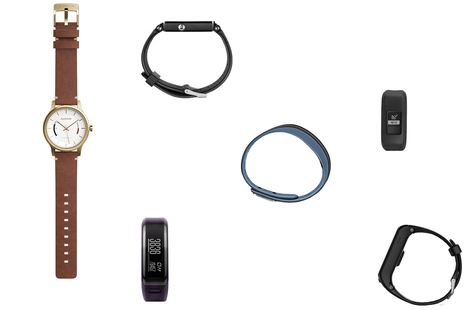
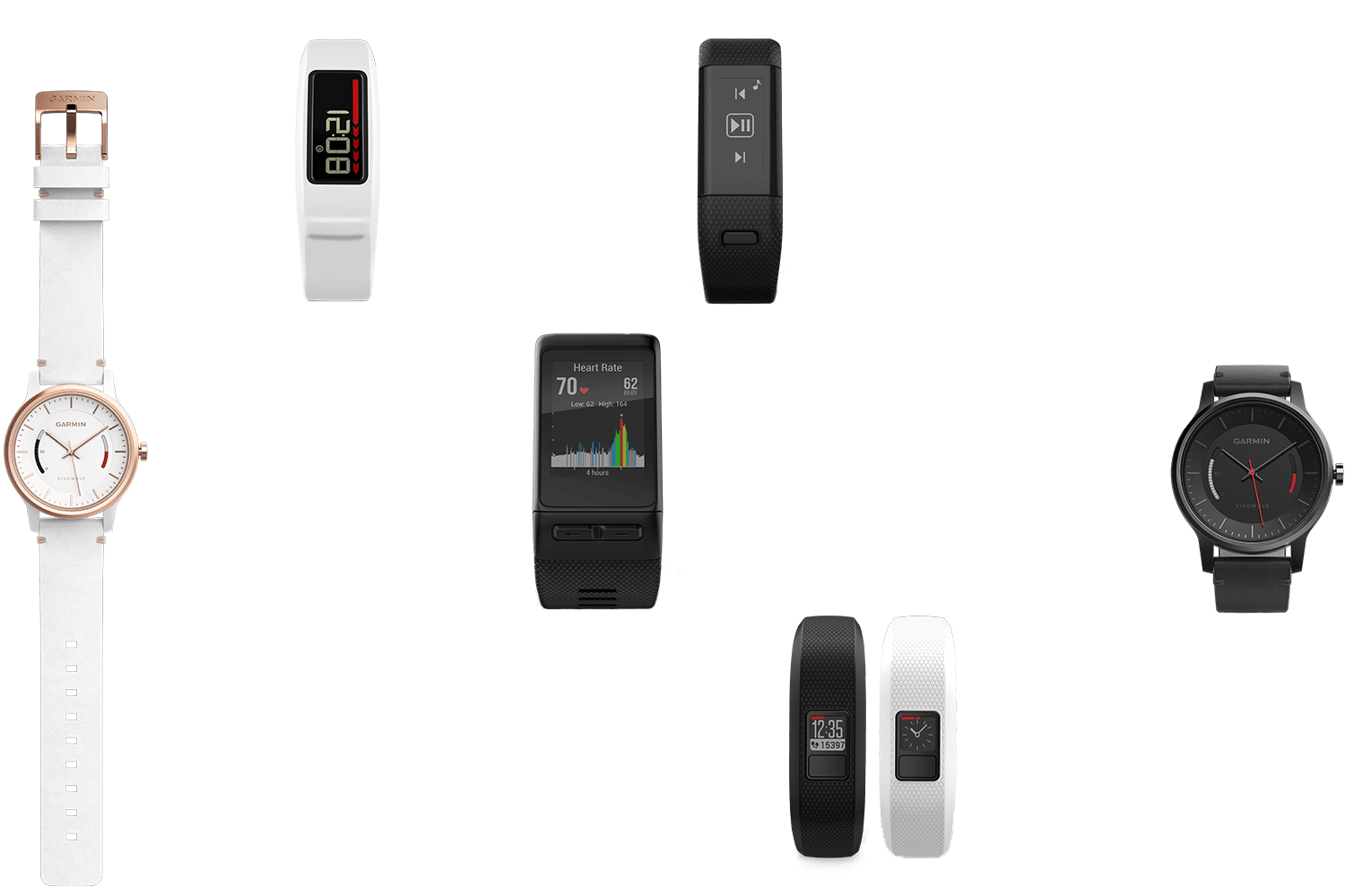
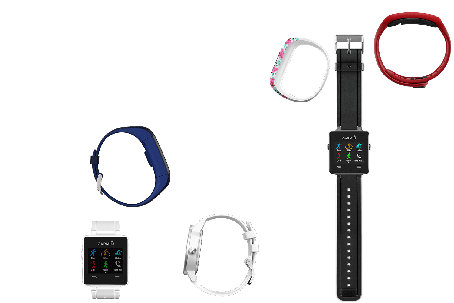
Our target user was in an exploratory mindset and likely didn't quite know what they wanted yet, so it was important to keep things abstract. The concept contrasted the hard work out of analyzing a spec chart, simply asking, "just tell us what you like".
Along with solving a user problem, the concept needed to work well into the overarching campaign. There were already some materials created (mostly a few videos), which provided an opportunity to use some wonderfully simple language: wear this.
Consistent lighting was crucial to the art direction of this project. I worked with Kent Snipes to shoot over 320 different images in a single day on stark white backgrounds. We outsourced portions of the COB work, and I adjusted color and comped shadows with 3d renders to finalize imagery.


The core experience was completely dynamic: from the over 50 different objects (20 + randomized questions), to the 10 possible results, the quiz was different everytime you took it. The experience transitioned from a 'finder for you', to a 'finder for them' during the holiday season.
At the time, React.js was definitely the cool kid on the block. After pitching the concept, I decided it was worth a few extra weekends to take the plunge into React, kicking off a whole new round of fun. It was a strong shift in mentality, something I wrote about here, and in the end, a pretty rewarding experience.
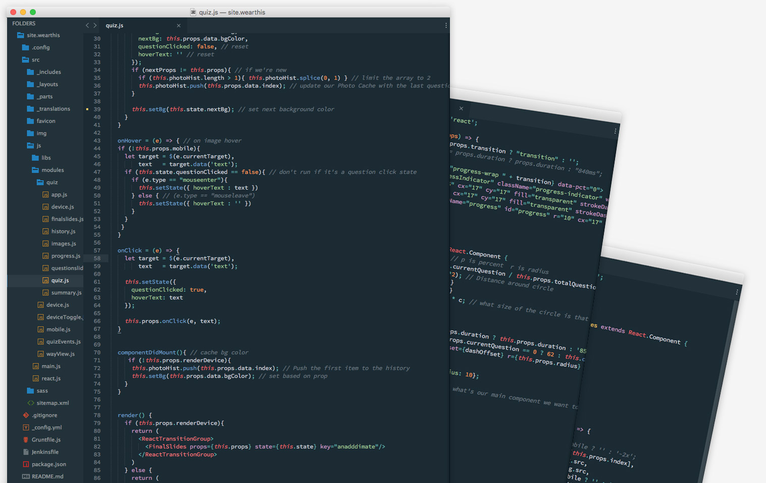
I built the core experience using a Jekyll install customized to support our 28 locales. Each language used around 400 lines of static YAML / Markdown instead of database entries. The quiz app was made dynamic through React.js, using inlined JSON data. React generated the device pages through AJAX calls to inlined JSON on static HTML which enabled sharing and better SEO without compromising experience.
From a DevOps standpoint, there were several folks in IT that helped refine pipelines and deployments. From a creative standpoint, I collaborated alongside Vanessa Righeimer (Copywriter), and Ryan Glendening (Creative Director).