
Centered around the release of Garmin's next iteration of its video camera, built for the professional enthusiast
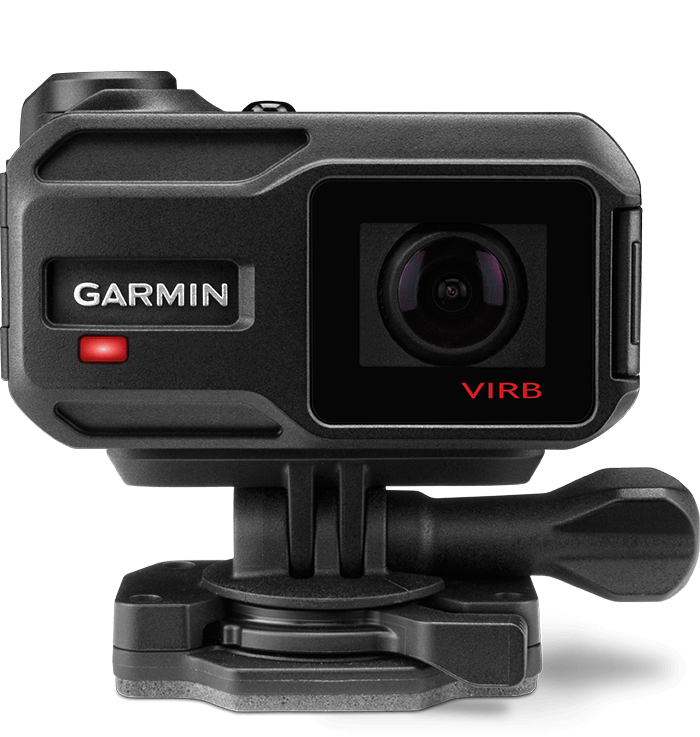
Garmin VIRB is a line of action cameras crafted for professional niche markets and leveraging advanced data integration and rugged design. At the time, it was one of Garmin's flagship products - the site alone generated over 5 million views.
Working with the awesome web team at Garmin comprised of UX researchers, information architects, copywriters, and developers over the course of 5 months, I led the art direction, UX / interface Design, as well as served as a front-end developer on the project.

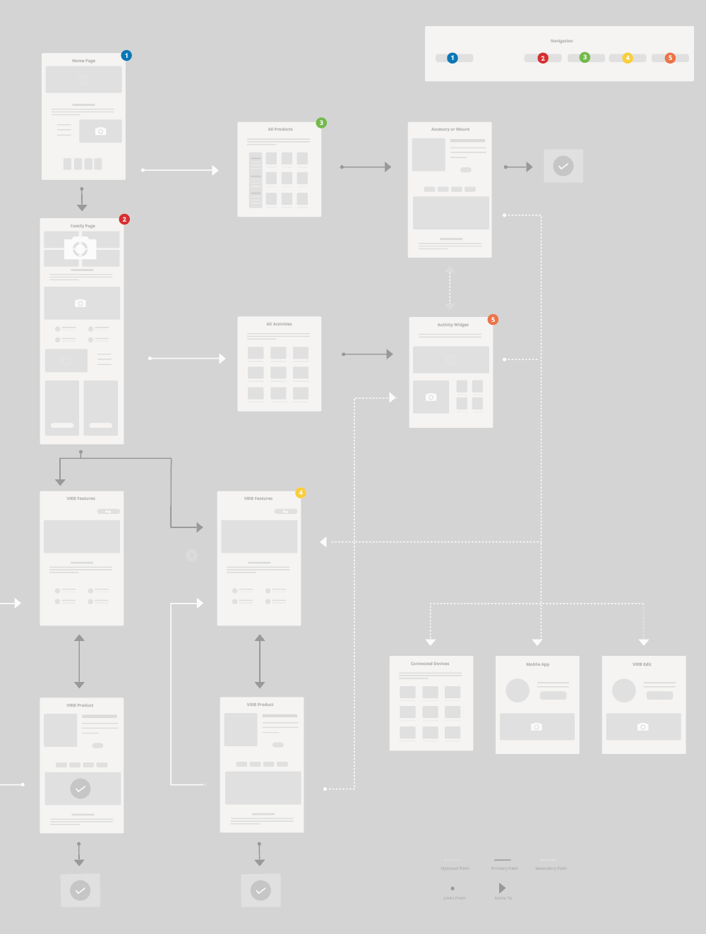
3 major rounds of user tests, 3 prototypes, and countless revisions were used to determine a broad content hierarchy, and user-flow that ensured users could better navigate and understand the site.
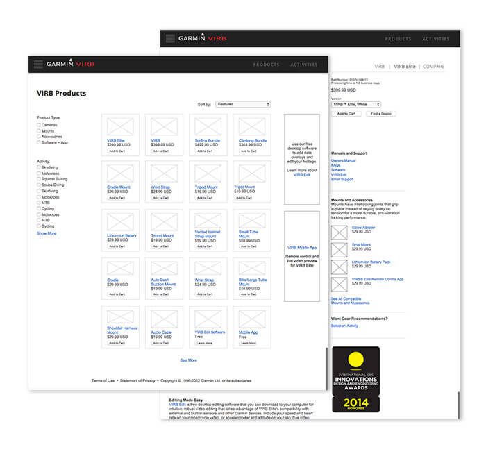
This project involved full ecommerce functionality, activity integration, products, shopping, grid view, and home pages. Organizing all of this in a cohesive structure and pitching it turned out to be quite the challenge.
The website led the visual art direction behind the VIRB project, so I had a pretty open opportunity to come up with a look & feel for the site. We kicked off the process by using moodboards that helped define the experience to something that felt actively technical, immersive, and expansive.
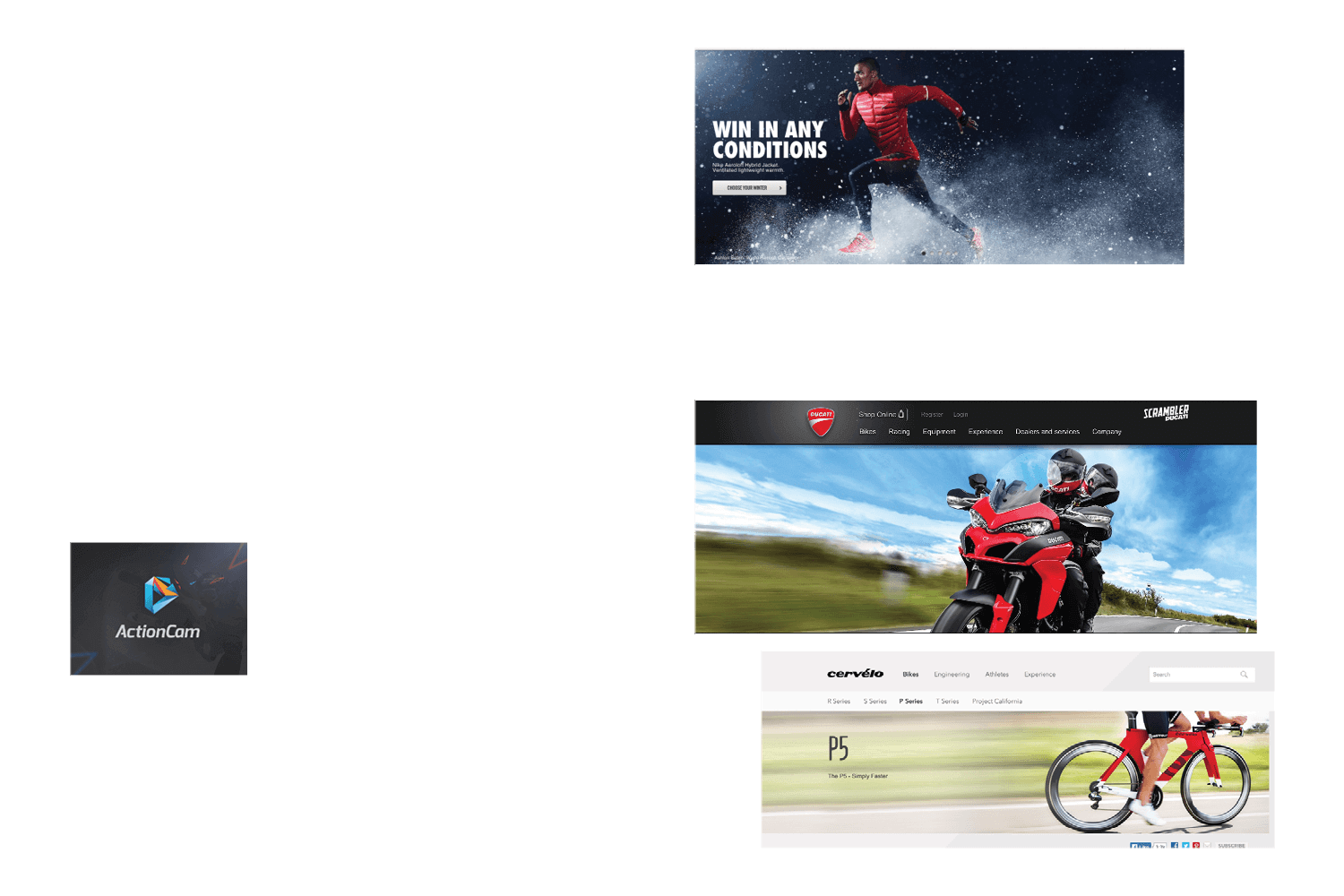
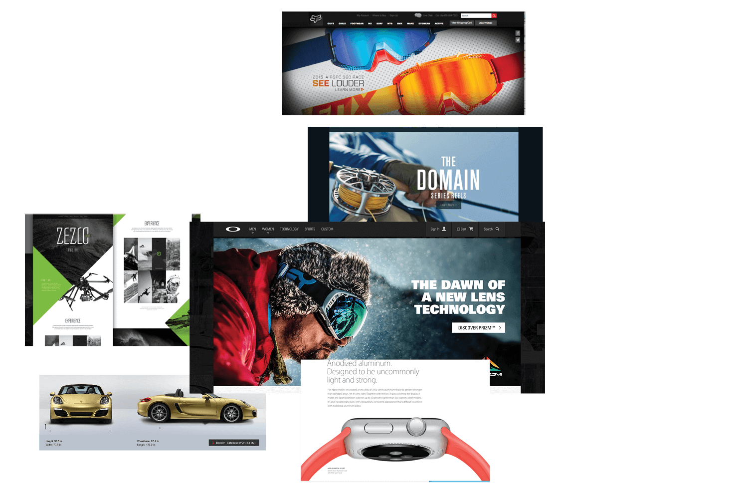
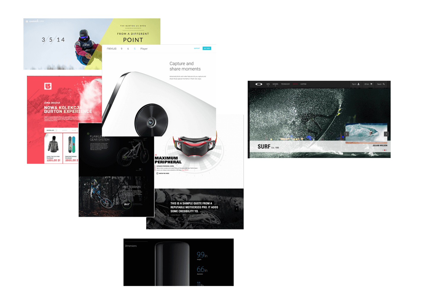
Looking for a challenge? Try getting 30+ people in a large corporation to agree on a design direction for a flagship project. It was crucial to get approval at the early stages of design. I came up with 3 styleboards that uniquely expressed an actively technical, immersive and expansive feel while addressing the goals of VIRB as a product.
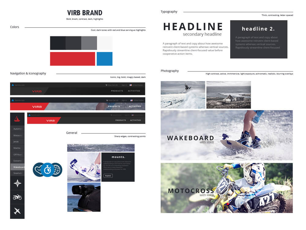
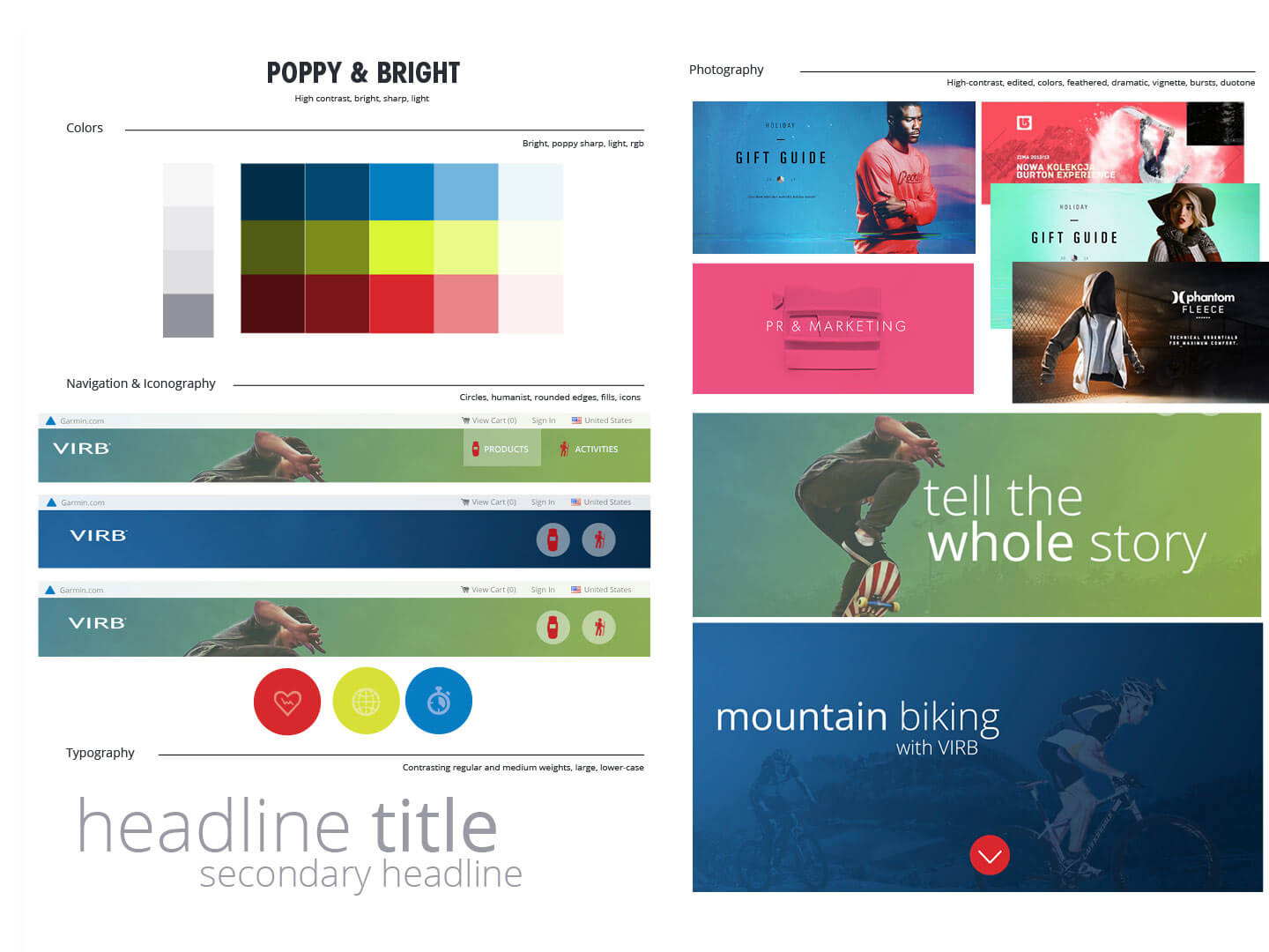
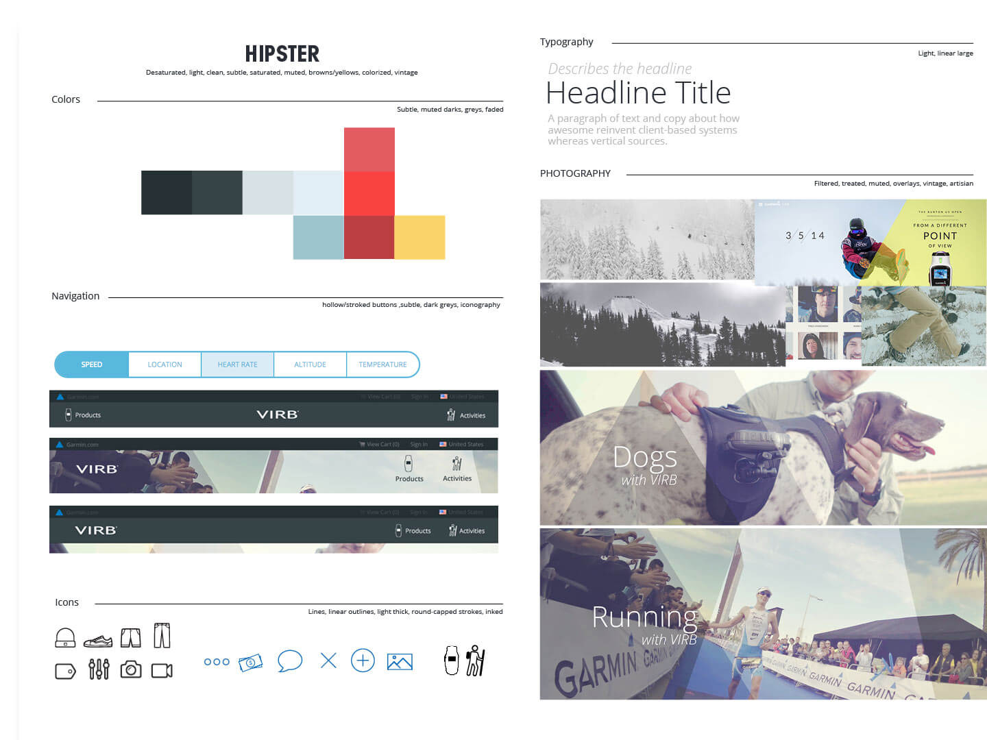
Color usually isn't my cornerstone – I'm not nearly as good at using it as other designers I know. What was initally a challenge – using a palette as extreme, youthful, vibrant and exciting as the target demographic – turned out to be a blast.

A user experienced two separate aspects of devices through a progressive page experience. While both pages centered on the features of the camera, the landing page (the first page) was keyed at what camera features allowed you to do, and the product page focused on the nitty-gritty, specific numbers, dimensions, and buy information.
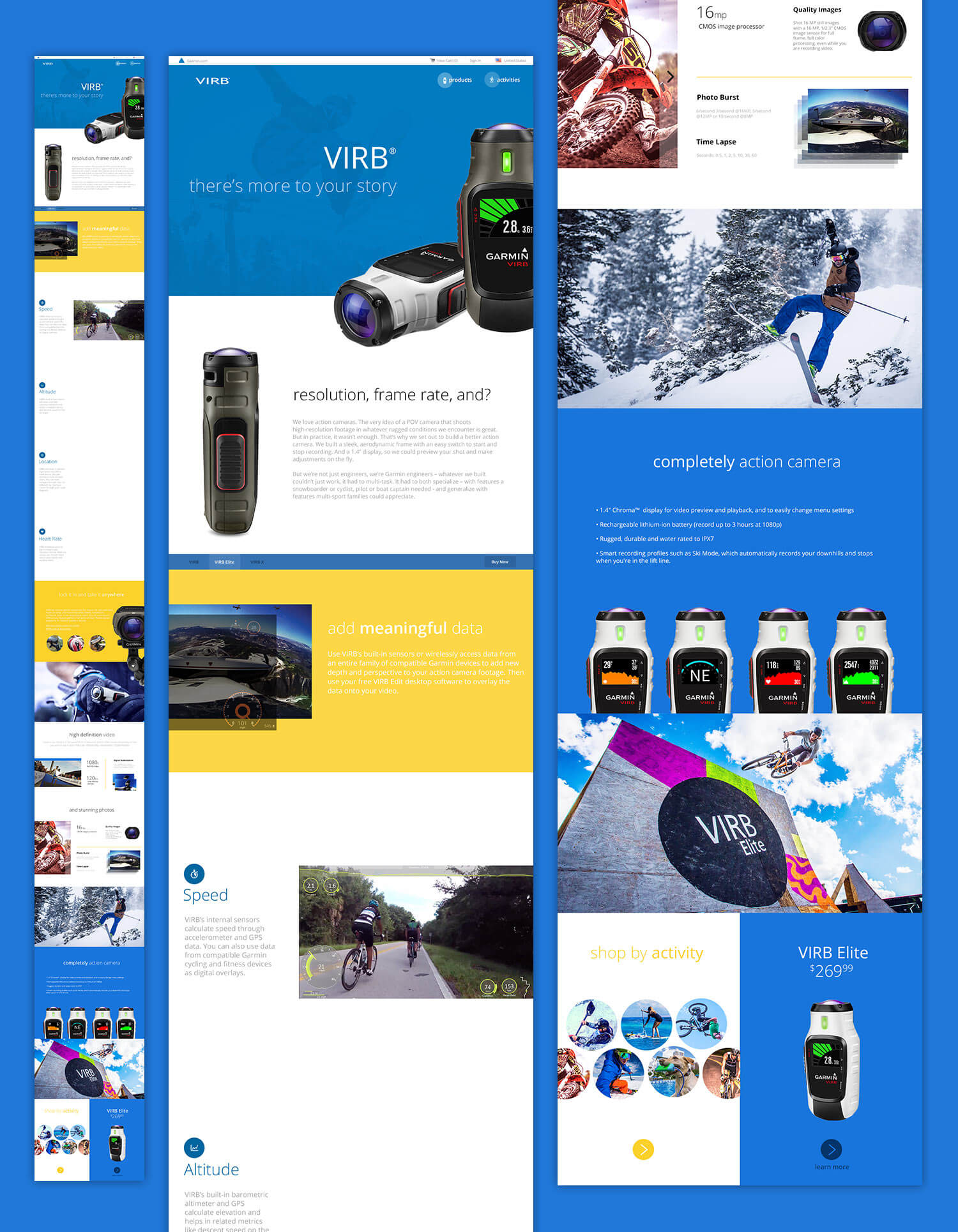
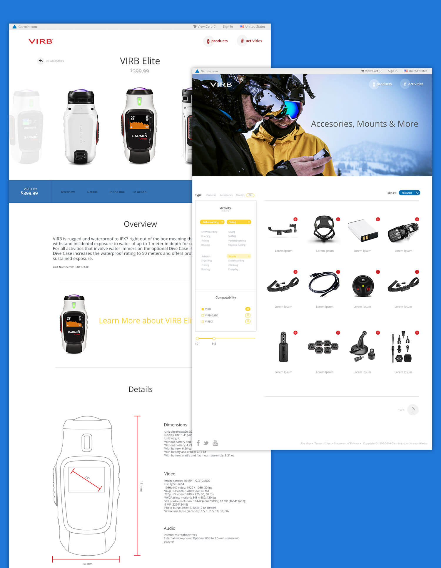
It was important to show a vision of what people could do & become with VIRB. Such a broad demographic left an interesting challenge; figure out a way to sell what you can do with the camera to several different niches. Activities solved this problem – working to help funnel specific interests and sell experiences based on interest.
This was one of the first sites I'd developed in a way that was truly mobile first, not just responsive - Meaning every decision made, from the amount of CSS styles loaded, to the way the Sass was written, to the sizes of images, was minimalist by default.
The core of the project was built on the Laravel php framework, and a homebrewed product API. We used Sass to organize our css, vanilla javascript, stash & Bamboo to host and deploy our git repos and Grunt to run our slew of automated tasks.
Credits to those who held a particularly intricate roll to in VIRB's success: Dustin Hayes (front-end architecture, back-end development), Aaron Gurley (project management) & Jamie Swearington (UX & IA).
Since writing this case study, I've had the opportunity to redesign several aspects of the site. In fact, I've redesigned about every page on the site. For better and for worse, it's part of the beauty of the web.