A startup that sought to simplify smart RSS/article reading.

JournalBot was a smart RSS feed / article aggregation app that learned and adapted to your RSS preferences. While the back end services and algorithms were being created, Chris & I worked to provide a vision for the customer experience, visual brand, and front-end code.
I had a blast collaborating with one of the best web designers I know, Chris Partise on this project. We worked together on UX, IA, and site structure. Being a single page app, it provided a great opportunity to focus on interaction design.

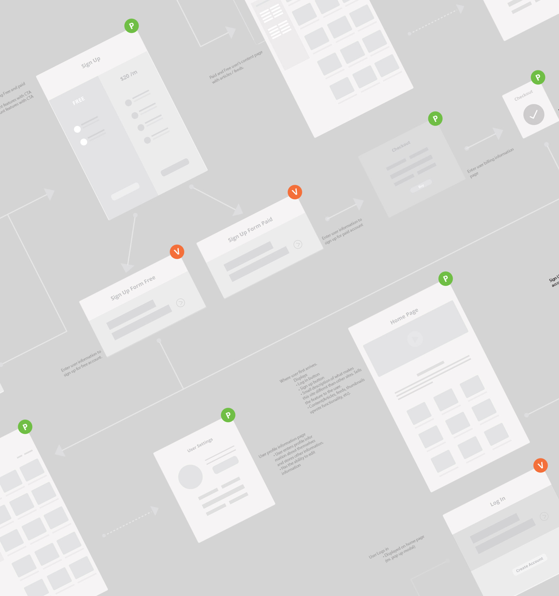
Developing and designing the experience for a fully functioning application can be quite challenging, particularly when it comes to communication. Pages, views, states, hovers, pop-ups, overlays all mush together and are difficult to represent. Using visual user flows, we mapped out all of the pages and views at the start and used this as our frame of reference for the rest of the project.

This was the heart of the app: where users spent most of their time, and where we spent ours. The app's smart capabilities, and its learning functionality were dependent on users manually categorizing articles based on their preferences. Thus, it was crucial to make filling out the form as easy, appealing, and natural as possible. We compressed a form that used autocomplete and validation into a plus button at the bottom of each thumbnail, and it worked swimmingly.
Knowing that a majority of users would be accessing the app on their phone, it was was important that things worked just as well (if not better) on mobile. The site was developed mobile first, which provided a interesting challenge working from desktop mockups. Fortunately, the flexible design provided ample room and structure to work well responsively.
The client for JournalBot was a back-end developer, and was building out the functionality of the app, so there was no need for a CMS, or complicated deliverables. The full source (Sass, and HTML partials) were leveraged for integration/maintenance. I used git for version control and to collaborate throughout the project with the client. To keep things private, I hosted the remote repository on Dropbox. For the build process, and concatenating the HTML/Javascript partials, I used my typical workflow of Grunt/Sass etc.